
Jim Krause | Classes | P354/J560 Program Graphics & Animation
Week 2
Announcements & Agenda:
- Share homework & Review Burrows & Wood reading, aesthetics & color
- Photoshop Odds & Ends
- Aspect Ratios
- Clone Tool / Content Aware Fill
- Scanning
- Blending Images
Burrows & Wood reading (review of chapter 10 from Television Production Disciplines and Techniques)
Three fundamental aspects of pictorial design:
- Balance and Mass
- Lines and angles
- Tone and color
Balance and Mass
Symmetrical verses asymmetrical balance.
|
|
Symmetrical balance |
Asymmetrical balance |

Symmetrical balance is rigid and formal
Asymmetrical balance usually is more interesting and dynamic- resulting in a more fluid and creative mood, while just as balanced aesthetically.
- Symmetry vs. Asymmetry by Stacey Kole
- Symmetry in Design: Concepts, Tips and Examples by Kalyla Knight
A heavy weight in the bottom tends to give more stability and security.
More mass at the top results in a feeling of uneasiness and suspense.
Lines and Angles
- Horizontal lines are restful, inactive and stable.
- Vertical lines suggest solemnity, dignity and dominance. Diagonal lines represent action, movement and impermanence.
- Curved lines imply change, beauty, grace and flowing movement. An upward flowing curve suggests freedom and openness. A downward, open curve has more of a feeling of pressure and restriction.
Tone and Color
- Light tones result in a delicate, cheerful, happy or trivial feeling.
- Dark tones result in a heavy, somber, serious and forceful feeling.
Tone affects balance
A dark tone carries more mass, weighs more and can be used to balance a larger mass that is light in color or tone.
A dark mass at the top of a picture tends to induce a heavy unnatural feeling of entrapment and depression, while a darker tone at the bottom gives it a more stable base.
A lighter tone or color at the top gives more of a feeling of solidarity and normalcy.
Color
Hues are subjectively classified as warm (reds and yellows) or cool (blues and greens)
- A Guide to Color Meaning by Adobe
- Emotional Associations of Color by Doug Ciofani
Warmer colors tend to be heavier than cool colors.
In addition to balance, mass, and color:
Depth - Is there a sense of Z-space? Are we looking at a something flat or into a 3-dimensional space? Light is often a good indicator and more tangible in 3-dimensional space.
Embedded Style - Do the colors, font choices, visual motifs, tie into the message or the purpose?
Robin Williams recap
- Contrast - Draw attention to the message (not away frrom it)
- Repetition - Repeat visual motifs, colors,
- Alignment - Use alignment to bring order from chaos
- Proximity - Place related elements together

LOOK and CREATE - Practice trying to recreate the looks of graphics you find pleasing.
Playing with Color
On-line color mixers:
Photoshop Tour and Basic Skills (continued)
Be sure you know how to do the following:
- Copy a layer
- Delete a layer
- Group layers:
- Link & unlink multiple layers
- Create layer folders
- Adjust a selection's brightness, hue & saturation
- Adjust a selection's opacity
- Rename layers (You can either Click the layer's title or Change the layer properties by right, or control clicking the layer)
- Apply layer styles (double click on the layer, but not the name)
- Create and edit text
- Create and edit shapes
- Rasterize vector objects (E.g. shapes and text)
- Resize elements
- Edit -> transform -> scale, rotate, etc.
- Apply a filter to a selection or layer
- Make a selection with the Magic Wand tool (tolerance setting)
- Select a brush/eraser and modify its size and feather
- Use the Clone tool
- Use Content-Aware fill
- Change the pixel aspect ratio (Under "View" menu)
- History - Cmd+Z is go back one (undo). Option+Cmd+Z will continue stepping back.
Web output:
If you are focused on web output, you'll likely save your image in one of the three common browser-friendly formats:
- GIF (limited color but supports transparency and can be animated)
- JPEG (supports 24-bit color but no transparency)
- PNG (24-bit color AND transparency)
GIFs are 8-bit so can only contain 256 colors. However they do support alpha channels (transparency). GIFs work great for cutout icons with limited colors and transparent backgrounds (like company logos).

JPEGs support 24-bit color but no alpha channels. So while you can't have a JPEG with a transparent background, they are great for high quality images such as photos.
PNGs support 24-bit color and transparency.
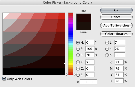
Open the color picker in Photoshop. Note there is a check box in the bottom left hand corner you can select if you want to only see web colors. If you are into HTML coding (E.g. making CSS style sheets) note that the hexadecimal value of the chosen color is displayed near the middle of the window.
Interesting test of web formats- Make a graphic with a nice gradient in it. Save it as a GIF and as a JPEG. What are the differences between the GIF and the JPEG? With the Save as JPEG options on-screen, drag the slider left and right to note the impact of various amounts of compression. A small amount of compression results in a larger file, but of higher quality. A lot of compression results in a smaller file, but of lower quality.
ASPECT RATIOS and CODECS - Are You SQUARE or NOT a SQUARE?
One job of the graphic artist is to be able to create imagery for a variety of different video formats. Before making any graphics or animations, determine what the video format and aspect ratio are. Some video formats use square pixels while others use non-square pixels. Non-square pixels are typically used with anamorphic formats. These are when the image is stretched to fit into a storage medium with a narrower aspect ratio.
Examples of square pixel formats include:
- Full-raster HDTV codecs, which will either use 1920 x 1080 or 1280 x 720.
Examples of non-square pixel formats include:
- NTSC DV (both 4x3 and 16x9 use pixel dimensions of 720 x 480)
- HDV & XDCam use 1440 x 1080
- DVCProHD 1080 uses 1280 x 1080
ASPECT RATIOS - HDTV uses a 16 x 9 aspect ratio. Standard definition television (SDTV) can be either 4 x 3 or 16 x 9. Films can be made in a variety of aspect ratios. Cinemascope (sometimes referred to as Panavision) is 2.35 x 1
- "Full frame" TV: 4:3 (1.333)
- Wide screen TV 16:9 (1.778)
- Cinemascope 2.35:1 (2.35)
Fortunately Photoshop has easy-to-use presets for most common formats. Use these presets whenever you can, as they make your job easier. They will provide the proper pixel dimensions with safe action and safe text guides, put you in the right color mode (RGB), and will display your artwork in the right pixel aspect ratio.
Pixel aspect ratio: Photoshop provides the proper pixel aspect ratio when you create graphics from a template. But Photoshop doesn't always know what to use when opening graphics created in other programs. If the graphic is not displaying properly, change the "Pixel Aspect Ratio" found under the "View" menu.
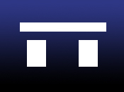
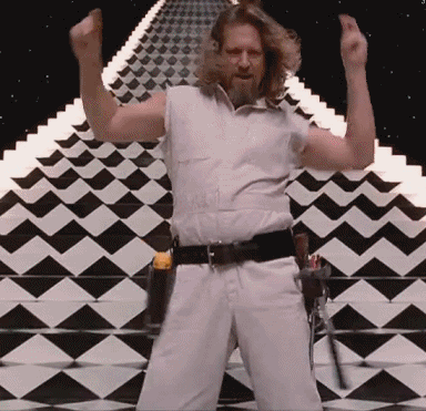
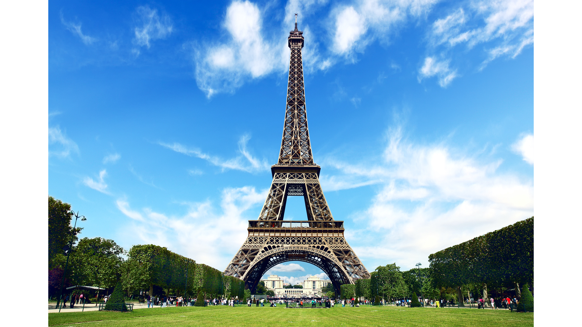
In-Class Exercise: Clone Tool & Content-Aware Fill (4 points)
- Cut out the Eiffel Tower element from this picture and fill it in using the Content-Aware or Clone tools.
- Fill in the white pillar-boxes at the sides.
- Turn in a PNG to the proper Canvas assignment.
Thursday
Scanning
Video editors and animators often have to digitize flat materials, such as photographs and artwork. Digitizing this type of media with a scanner produces higher-quality results than capturing with a camcorder or DSLR. It also ensures that there's no physical distortion, such as keystoning.
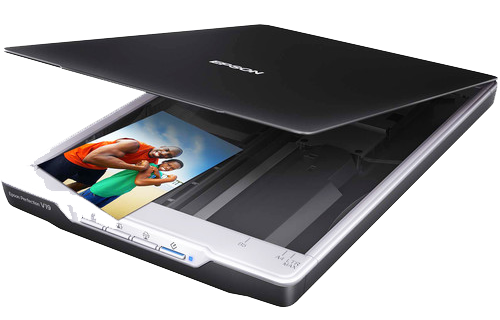
Scanners can capture images at a very high resolution, resulting in extremely large files. It's good practice to scan images into a resolution higher than you need, but not too much larger, or else the files become cumbersome to work with.
What resolution / DPI should I scan in? It depends on several factors:
- The size of the original image
- The pixel dimensions of the video codec the images will be used in (E.g. 1920 x 1080)
- The size of the image when displayed via the video codec
Imagine you have a 6"x4" photo of something you'd like to use in a documentary. You'd like this photo to fill the entire screen of 1080i HD video (1920 x 1080 pixels). Scanning the artwork at 100 dpi would result in a 600 by 400 image- not quite large enough to fill the screen. Scanning it at 200 dpi would result in an image measuring 1200 x 800 pixels. 400 dpi would give you 2400 x 1600 pixels. This is much closer to what you need.
So before scanning, consider the size of the artwork and how large it needs to be displayed within the screen. This will help dictate the proper dpi resolution for scanning.
Notes on seamlessly merging images:
In order to realistically combine images it's important that they are similar in terms of color, tonal balance and exposure. The angle of perspective should match as well as the angle and quality of light (E.g. key light).
In class tutorial: Merging two images
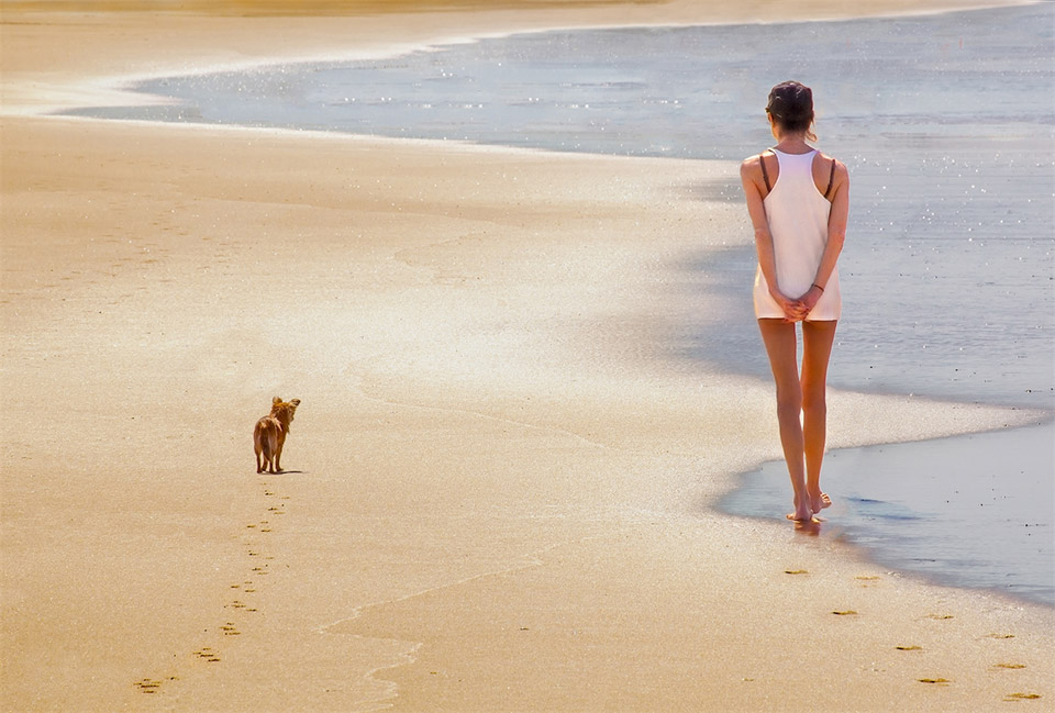
You can download some of these images to experiment with:
- pic1 (beach and sky)
- pic2 (little girl)
- pic3 (lady sitting on beach)
- pic4 (walking on beach)
- pic5 (beach aqua)
Make sure you try out various selection tools:
- Lasso
- Magnetic Lasso
- Quick Selection
- Magic Wand
There are two good tools in Photoshop that help refine selections and masks:
A few keyboard shortcuts to remember:
- Command + = Zoom In
- Command - = Zoom Out
- Spacebar = Hand Tool (move work area around)
- Command - D = Deselect
- Holding Shift will add to your selection
- Holding Option will remove from your selection
- X will swap foreground and background colors
In-Class "Merge" Exercise (6 points)
Assignment Goal: Create a 16:9 TV graphic (1920 x 1080) made up of two images seamlessly merged together.
Instructions:
- Using Photoshop's HDTV 1080p preset, create a new document.
- Find two images you wish to merge together. Consider lighting, shadow, reflection, etc. Please label/name them as "source1" and "source2" and upload these to the appropriate Canvas assignment (so I know what source images you are working with).
- Using Photoshop, seamlessly merge the two images.
- Save the PSD file you are working on (for future use) and output ("Save as") a PNG graphic to turn in.
- Name your PNG graphic "merge" and upload it to the Canvas assignment.
Rubric:
- Source images (1 point)
- Technical/aesthetic execution of merge (5 points)
Week 2 Vocabulary:
- Bit Depth: (Color depth or pixel depth) is the amount of color information
in an image file. The more bit depth, the more colors you can reproduce.
- 8-bit - 256 colors
- 16 bit - thousands of colors
- 24-bit - 16.7 million colors
- A three-color RGB channel actually consists of 3 separate 8-bit channels. When you add an alpha channel (another 8 bits) it adds up to a 32 bit image
- Codec - short for coder/decoder (or compressor/decompressor). It is a specific way to pack and unpack data for storage media. (E.g. JPEG, MP3, DV)
- CRAP - Know what it stands for! Contrast, Repetition, Alignment, Proximity
- Landscape oriented - Visual pieces that are wider than they are tall (like a movie screen)
- Portrait oriented - Visual pieces that are taller than they are wide.
- Pixel Aspect Ratio - mathematical ratio of pixel width to pixel height. 1920x1080 & 1280x720 are both square pixel formats. DV & HDV are both non-square pixel aspect formats.
- Quick Mask Mode - A mode in PhotoSHop that lets you refine selections
- Rasterize - Rasterizing takes vector objects and
converts them into pixels or bitmaps. If you rasterize a text layer
so that you can apply
effects, you will no longer be able to edit it as text.
- One of my favorite ways to rasterize layers in Photoshop is to create a new (empty) layer below the one I want to rasterize. Then I merge the layer I want to rasterize down into the empty one.
- Select and Mask - A mode in PhotoShop that allows one to refine selections.
Homework (due by the start of next week's lab):
Pick a real or fictitious show, event, cause, or product to promote. (A graphic promoting your YouTube channel, an ad for a callout meeting, an upcoming concert, or an art opening, etc.)
Create two different 1920 x 1080 sized TV graphics to promote your event, concert, show, etc. Be sure to take totally different artistic approaches with your two graphics. One might have an organic/natural looking feel to it. The other could look high-tech, shiney, and futuristic. Please make your homework out of your own (original) material. Consider using a few of your existing photos or taking a few new ones. You could even use a frame from one of the videos you've produced.
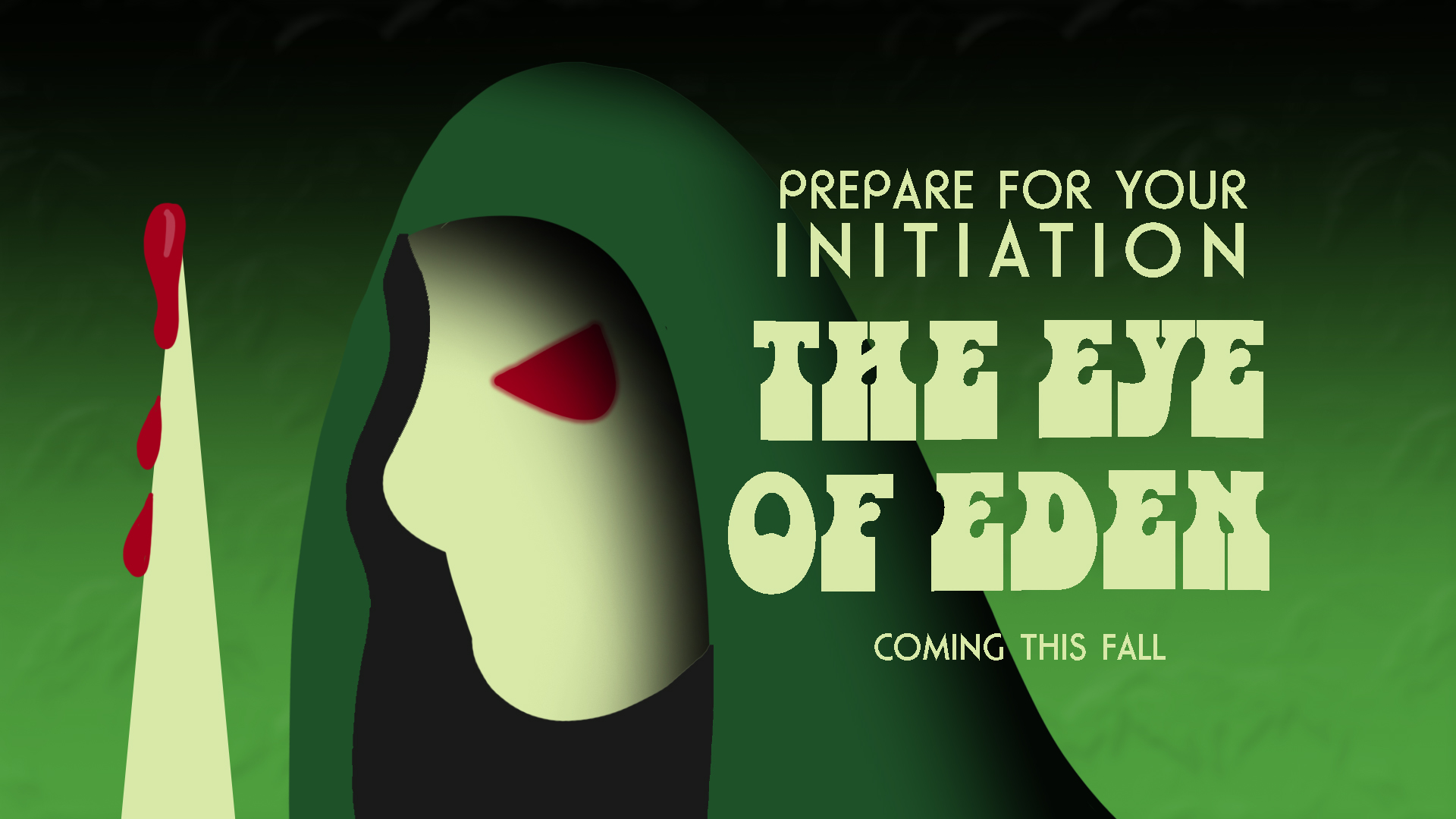
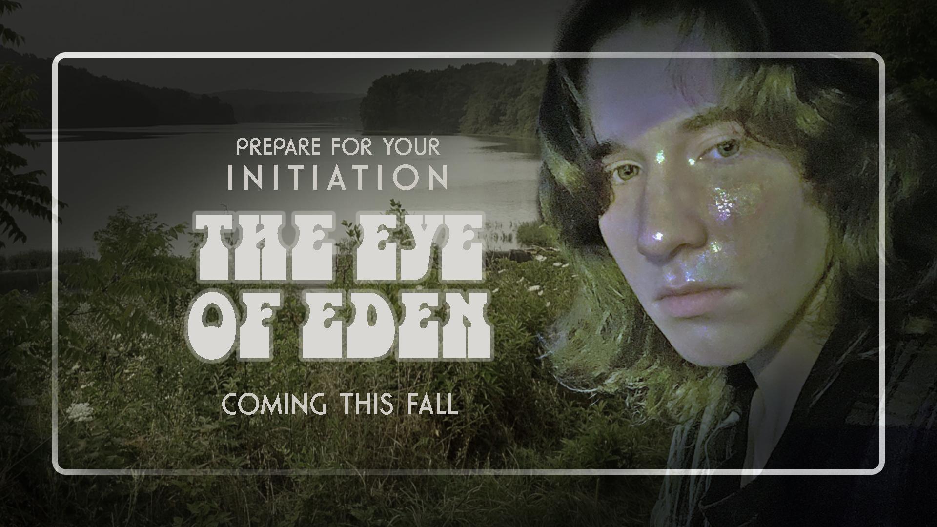
Here's an example by Nick Johnson:
The two graphics should:
- look different and have different visual styles
- have the exact same (obvious) message/purpose
- at least one of your graphics should contain two images seamlessly merged together
Naming & Turning in:
- Name your two 1920 x 1080 JPEG graphics "yourIUloginID_1" and "yourIUloginID_2" (Be sure to keep your original PSD file so you can re-edit the images when needed.)
- Take your source images and place them in a folder called "sources". Zip/Compress this folder and turn it in to Canvas along with your 2 JPEG graphics.
