
Jim Krause | Graphics Overview
This brief article covers a few topics, which are essential to working in graphics:
- Color Modes
- Bitmap & Vector Graphics
- Anti-aliasing
- Typography
- Serif & Sans-Serif typefaces
- Tracking, kerning, and leading
Color Modes
Color can be objectively described in a number of ways. One of the most common methods is using the HSB model:
Hue (the actual color)
Saturation (the strength or intensity, or how far it’s removed from gray)
Brightness (how dark or light)
Color Modes
But you can also describe color in other ways- depending on what color mode you are working in. Two color modes you should be familiar with are:
Additive Color (RGB)
Subtractive Color (CMYK)
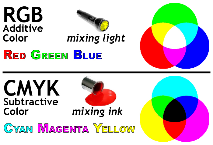
Additive Color is the color system used for computer graphics, TV and lighting design. This is the color mode used to create graphics for TV and web. It's referred to as additive since lights are mixed or combined to make the various colors.
- Red
- Green
- Blue
The primary colors (think of them as light sources) are:
Mix them together and you get white.
Subtractive Color is the color system used for printing. It's referred to as subtractive because the colors absorb (subtract) some light and reflect others.
- Cyan
- Magenta
- Yellow
The primary colors (think paints or inks) are:
Mix them together and you get black. (K stands for "key" or black plate.)
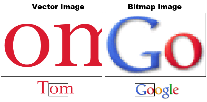
Bitmap and Vector graphics
Bitmap or raster images, use a grid or array of pixels to represent an image. The grid is made up of squares or pixels. Each pixel is given a specific color and brightness. If you enlarge a bitmap graphic, you will eventually see the grid.
Photos you take with your phone or DSLR, scanned images, and captured video frames are examples of bitmap graphics.
Vector graphics are made up of shapes, lines and curves that are defined mathematically.
When you draw a circle or create a piece of text with a vector-based application (such as Adobe Illustrator), it keeps track of the lines and angles that make up objects. From this mathematical data, it draws the display. We can scale a piece of vector artwork up to any size, and it will still retain its quality.
Fonts or typefaces are examples of vector graphic objects. You can scale fonts up as much as you want and the edges will never become jagged.
Anti-aliasing
You can turn this feature on and off. It produces intermediately shaded pixels to smooth out the appearance of jagged edges. Note the anti-aliasing which is apparent on the enlarged image on the right hand side.
Typeography
Text is the most important element used to convey information in graphics. Whether in a title sequence, a lower third, the price of a product, stock market figures crawling across the screen, or the final scrolling credits of a movie, knowing how to properly use text is essential to graphic production.
It's also possible to make compelling pieces of art based primarily on text. Check out these examples:
- http://vimeo.com/3829682 ("Like, you know" written by Taylor Mali)
- http://www.youtube.com/watch?v=6mnvvVi4HaI (based on Lock, Stock & 2 Smoking Barrels dialog)
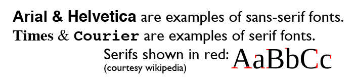
Serif and Sans-serif
Serifs are small details found on the end of some fonts. In typography we can describe a font as either serif or sans-serif. (Sans means without.)
Arial and Helvetica are examples of sans serif typefaces.
Times and Courier are examples of seriffed typefaces.
Typographers generally believe that large blocks of text are more easily read by using a seriffed typeface. This is why books, newspapers and magazines primarily use seriffed typefaces in the main body of text.
Tracking, kerning & leading
Tracking refers to the horizontal spacing of an entire group of letters on the same line.
Kerning is the space between individual letters. For example you’d want to kern a small case letter “o” to fit underneath the capital letter “T”.
Leading (pronounced to rhyme with bedding) is the vertical spacing between lines of text. You can think of it as line spacing.
![]()
Jim Krause Home page - sample file: Sailing.psd
