

Articles | Jim's Graphics Tips
These basic guidelines can help you avoid common mistakes when creating graphics for TV and film.
Technical Tips:
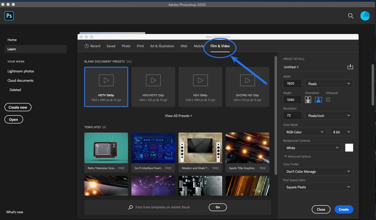
- Tip #1 - Use Photoshop's built in TV/Video templates. For 1920x1080 HDTV use the "Film & Video" category / "HDTV 1080p". This will:
- provide the proper pixel dimensions (1920 x 1080)
- put you in the proper color mode (RGB)
- provide safe text & action guides
- use a square pixel aspect ratio
- Tip #2 - Keep text inside the safe text area. The outside edges of the screen can be cut off by the physical frame bordering the TV display. In addition, networks often use the corners for logos and run content along the bottom. Even if your text and other foreground elements fit inside of the safe text area, make sure they have a little extra room around the edges to "breath".
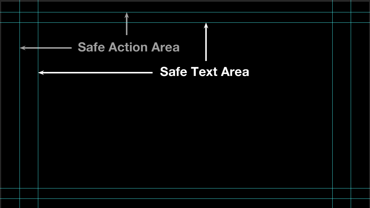
- Related to this:
- Avoid having important visual elements end near the edge of the
screen. Place the edges well within the safe action area
or have them run off the edge of the screen. On a similar note, avoid using a frame within a frame. If you must
do this, make sure your frame is inside of the
safe action area.
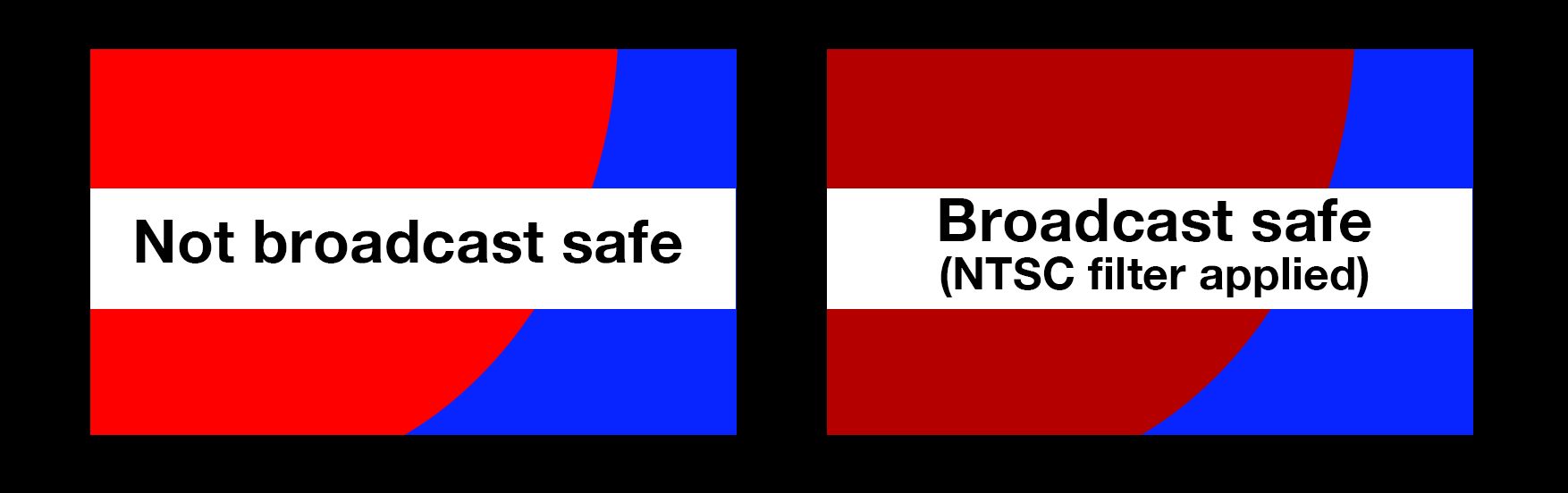
- Tip #3 - Use broadcast-safe colors. Photoshop can create colors with saturation and brightness values outside the range of what's technically supported by broadcast. If you’re not sure, you can apply Photoshop's NTSC filter to bring the color values into the acceptable broadcast range. Most video editing software has a filter you can apply that does the same thing.
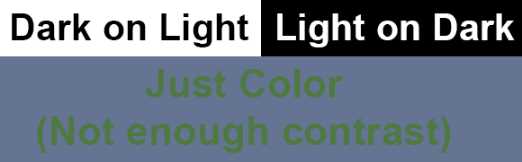
- Tip #4 - Make your text visible. It needs to be large and bold enough to read and there needs to be enough contrast for it to stand out over the other visual elements
When looking at an image, our eyes are drawn to the areas of highest contrast. You want the points of highest contrast to be your information, which should supersede all other visual elements. It's a good idea to use light letters on a dark background or dark letters on a light background.Relying on color alone isn't enough to make your message stand out.
Make sure keyed graphics (E.g. lower third ID graphics) stand out well and work with the background. Consider the video as your background layer and make sure your text is visible. You might need a background, an edge stroke, or some drop shadow to make the text visisble.
Don't use type that's too small, delicate, or thin, or single-pixel horizontal hairlines. Fine details are not only hard to see, but can flicker due to the interlaced video signal.
There are no clear rules for typeface size, as it depends on the font you are using and how much contrast you have in relation to the background. One of my tricks is to stand back from the monitor about 8 feet. Your text should be easily readable.
Timing - Be sure to leave your text up long enough to read. A good rule of thumb is to leave it on screen 1 and a half times the length it takes you to read it.
Composition/Aesthetic Tips:
- Use just a few colors. A common mistake is to use too many colors, or colors that don't work well together. Most eye-catching graphics use only a few carefully selected colors. If you're new to color design, try using the palettes from Color Hunt.
- Need a design idea? Not everyone is a gifted designer. There's nothing wrong with imitating a style or look of an existing film or documentary. A good repository of visual designs (movie posters, titles, ads, etc.) can be found at Fonts in Use- TV & Film.
- Use tried and proven compositional techniques. Most classic principles of visual design work quite well when applied to TV graphics. In other words, you can use the Rule of Thirds, the Golden Mean, or any other visual design techniques. Some great tips and an overview can be found on Wikipedia
- Avoid overly complex backgrounds. Don't let a busy background interfere with the message. Delicate or ornate text requires a simple background. Complex backgrounds work well with bold and simple foreground elements.
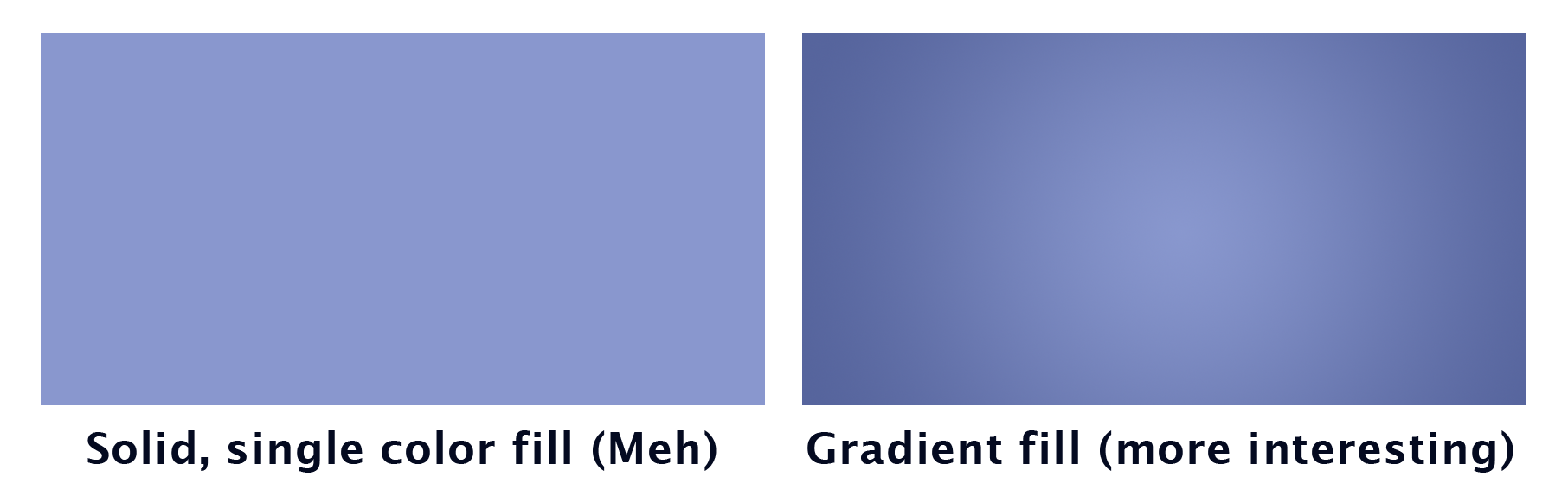
- Avoid filling backgrounds and areas with a single, flat color. Try adding a little vignette or subtle gradient to it.
- Text - Don't think like a word processor. Think about how you can fit letters, words, or phrases together in creative ways (creative typography). Simple parameters you can change include a font's style, weight, size, color, case, and baseline. If you render (rasterize) your text, you can apply filters or manipulate it in interesting ways.

- Robin Williams has an excellent book: The Non-Designer's Design Book. In it, she outlines four basic principles of graphic design. Contrast, Repetition, Alignment, and Proximity. There's a good recap in wiredcraft.
- Contrast - The higest points of contrast should be your message, not ornamentation or background elements. Whether looking at a painting, a photograph, or a screen, viewer's eyes are drawn to the points of highest contrast.
- Repeat elements (colors, shapes, etc.) for greater interest and to create a visual theme or motif. Repetition is commonly used in music, dance, and visual media.
- Align elements to create order.
- Proximity - Place elements that reinforce or relate to each other close together.
Terms you should know:
- HSB - Stands for hue, saturation and brightness. Used to identify a color. Hue, (sometimes thought of as tint) is the actual color, saturation (sometimes called chroma) is the amount of color present (no saturation or chroma means the image is B & W), and brightness, which is how light or dark the color is.
- Leading- the spacing between lines
- Kerning- the space between individual letters. For example you’d want to kern a small case letter “o” to fit underneath the capital letter “T”.
- Tracking – the spacing of an entire group of letters
- Anti-aliasing- Smooths out jagged edges on graphics. This is usually an on or off option. It works by creating intermediately shaded pixels between areas of high contrast.
